 Local Service Mastery
“Where should I put the contact form, video and buttons on my home service website so more visitors turn into leads?” A home service owner asked me exactly that on one of our weekly group call sessions, and if it sounds like your business, this post is for you.
I’m Lior Vaknin. I’ve spent 15 years running marketing for home service businesses, and every week I answer questions like this one live with our members. Below are five rules for the best landing page for a service business, and the last one is the one every owner serving more than one town needs to get right.
Asked on our weekly group call: “Where should I put the contact form, video and buttons on my home service website so more visitors turn into leads?”
Short answer: put the form on the right side of the top section, use two clear buttons, and place a short video high on the page. Check everything in mobile view first, and make sure every town page is genuinely different from the others.
What your landing page has to do first
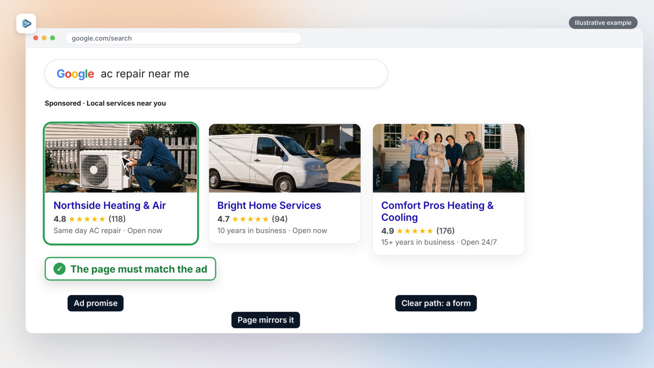
Before the layout, remember the job of the page. Google says to choose a landing page that mirrors the action your ad or link promised and “provides a clear path to take that action, such as purchasing a specific product or filling out a form.” For a home service business, that action is usually a request or a call. Every rule below is about making that path obvious. You can read the guidance in Google Ads Help.
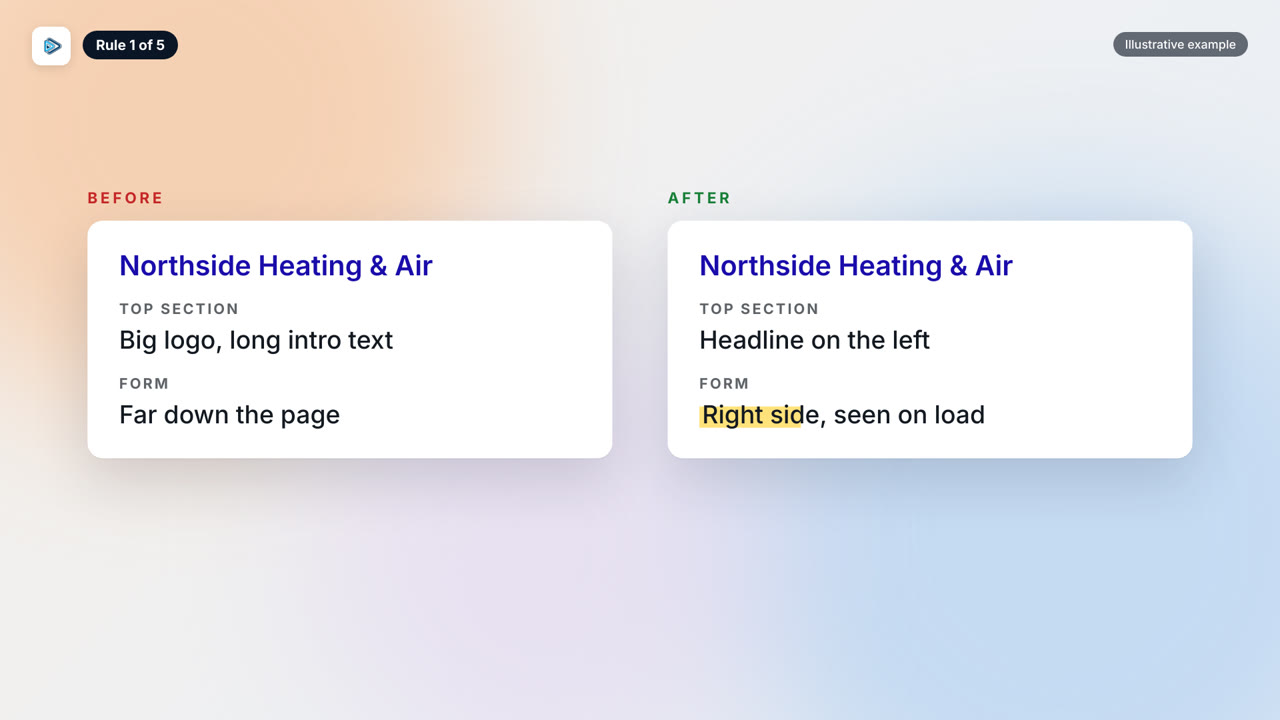
Rule 1: Put the contact form above the fold
Place your contact form on the right side of the top section, not below it. The moment the page loads, visitors should see it without scrolling. Keeping it above the fold is the simplest change most owners can make.
Google’s own example is about a free tour: “if your ad text encourages customers to sign up for a free tour,” then the landing page should feature the sign up form prominently. In other words, make the form match what the visitor came to do. You can find it in Google Ads Help.
Keep the form short. Google warns, “On mobile, forms are inconvenient and can cause visitors to leave before they make a purchase.” That is why a tap to call option should sit right beside the form, so a visitor who does not want to type has another easy way to reach you. The warning comes from Google’s mobile landing page guide.
Rule 2: Use two clear buttons
Give visitors two buttons: book an appointment and call. That is all. Google says a strong, clear call to action “tells mobile visitors what to expect and encourages them to perform the action you want them to take.” Two choices make that easy. Ten choices do not. The quote is from Google Ads Help.
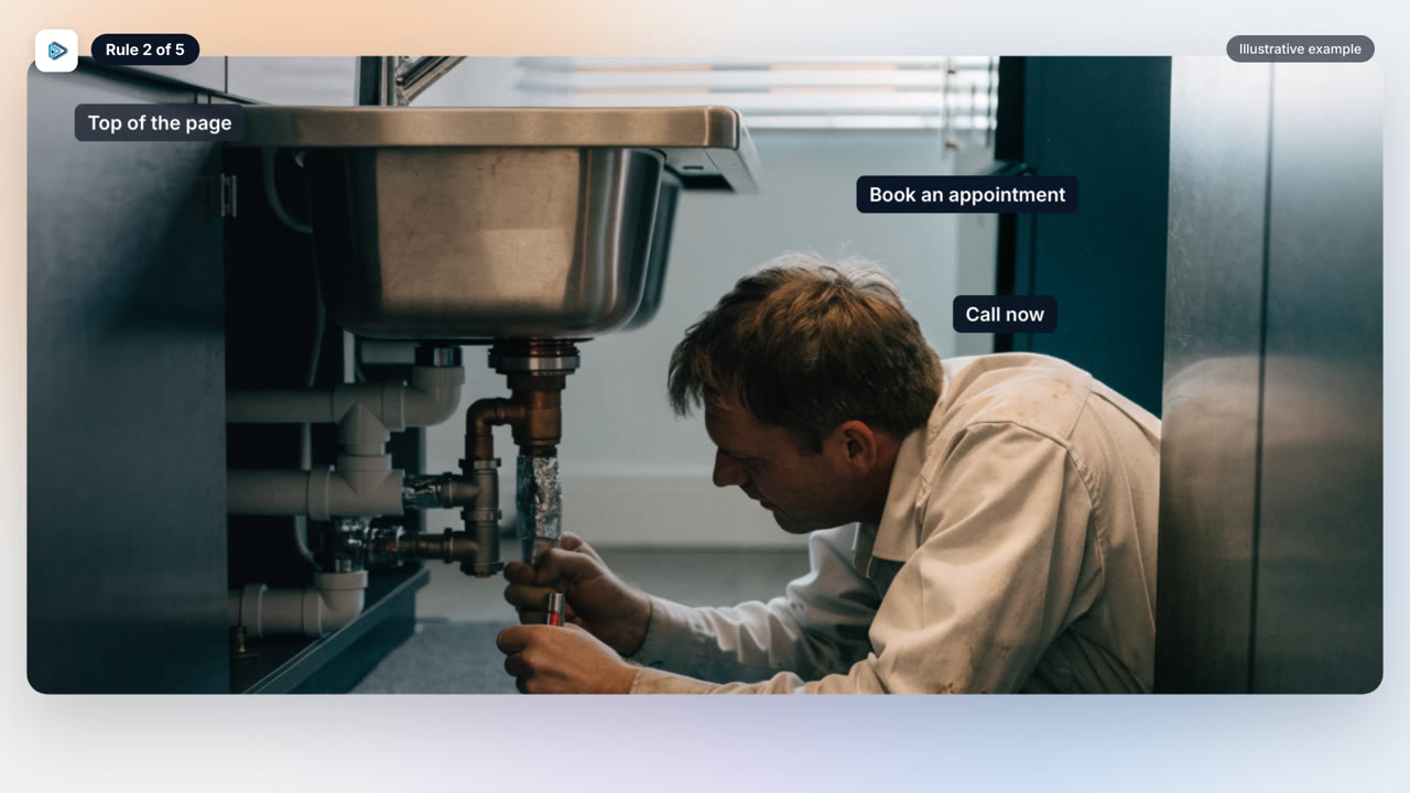
Here is where owners go wrong. They want to say “we offer same day service,” so they turn it into a third button. Don’t. A line like that should be plain text. Every extra button waters down the two that matter, and the visitor ends up unsure what to click first.
Read your top section as a stranger would. If someone can tell in three seconds how to book or how to call, the buttons are doing their job.
Rule 3: Put a video high on the page
Put a video near the top. Two types suit a landing page: a short teaser that gives an overview of your company, or a client testimonial. Visitors want to see that other clients used you and what they said, and a testimonial shows it better than any headline.
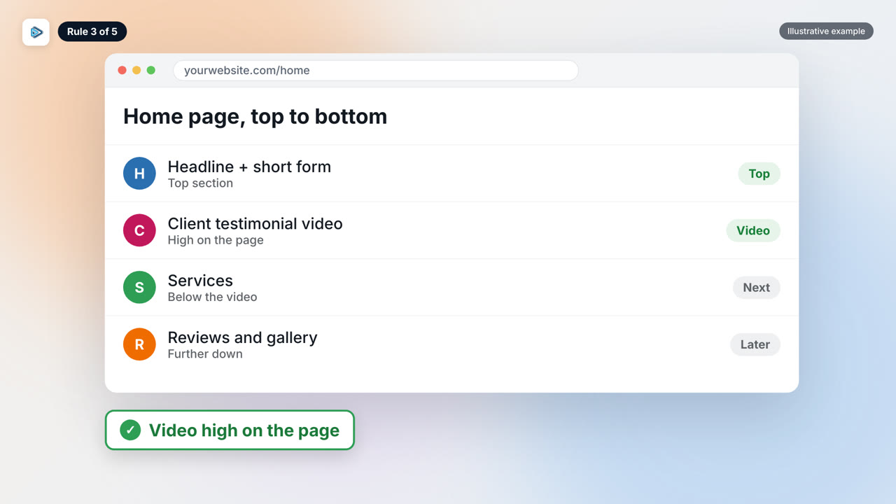
Where you place it matters. Google’s guidance is to “Place the video in an easy to find position on the page when viewed on a mobile device.” See the full note in Google Search Central.
Google also says video “is also a strong way of influencing potential customers to buy, but bear in mind where your content might be viewed.” You do not know whether someone is watching in a truck, a waiting room or a quiet house, so keep it short and make it understandable without sound. That advice is in Google’s mobile landing page article.
Save videos about a specific job for that service’s own page and add them lower down. That keeps the top of the main page focused on one clear first impression.
Rule 4: Check your site in mobile view first
Between 80 and 90 percent of traffic comes from phones, yet most owners build and review their pages on a desktop screen. Flip it. Open your site in mobile view first and judge it from there.
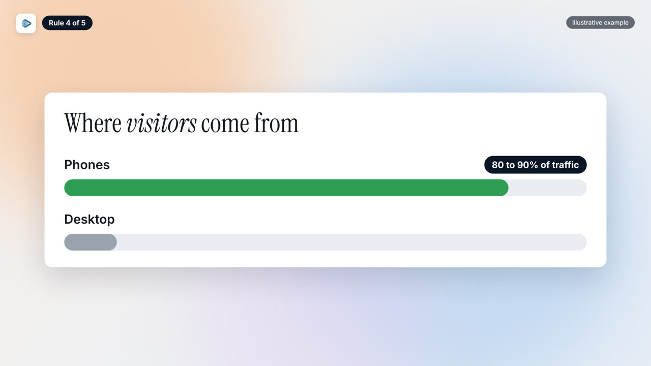
Two problems show up almost every time. First, a big logo banner at the top takes up too much space, and that is the space your form and buttons need. Drop it or shrink it. Second, the service text and fonts are too small, so make them much bigger.
Google says the same thing: “This means your mobile site should be free of clutter, easy to read, and quick to load.” The source is Google’s mobile landing page article. If you can, keep a call button visible at the bottom of the screen too, so the next step is always one tap away.
Rule 5: One video can serve many towns, if every page is different
If you serve more than one town, you do not need to start from scratch each time. Duplicate the same page design for every city, then tailor the headline and page title to each town. That is what helps with local SEO. You can also reuse a regional case study, such as a job done in one county, for nearby cities and neighborhoods. The same approach works for services: duplicate the page and change the content, for example from water restoration to fire restoration.
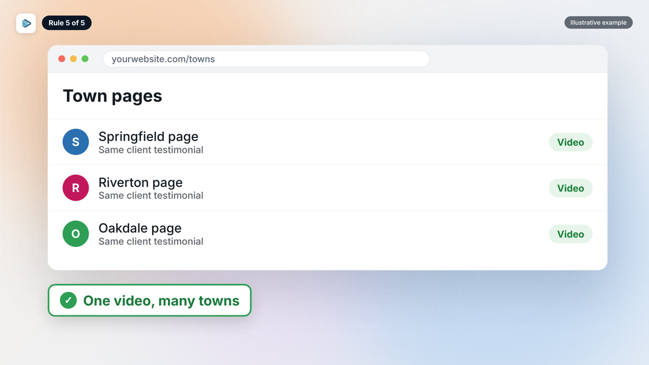
Reusing a video is not the problem. Google says, “It is fine to include the same video on both a dedicated page and the product page.” That example is about product pages, but it shows reuse is fine in itself. See Google Search Central.
The risk is swapping only the town name. Google’s spam policy says, “Doorway abuse is when sites or pages are created to rank for specific, similar search queries.” It also lists pages “targeted at specific regions or cities that funnel users to one page.” Both are in Google’s spam policies. So add real local detail to every page, like a nearby job, so each town page is a useful destination in its own right.